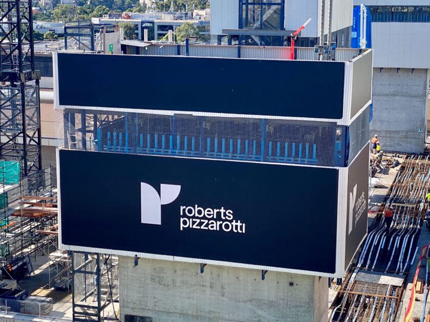
Maximum Impact: design principles for outdoor signage
28 June 2020
3 mins read
At Mesh Direct, we specialise in the kind of outdoor signage that puts your brand front-and-centre. Our expert design and install teams are there to help guide you through every step: from developing your idea into a cutting-edge design through to making sure it’s perfectly installed for optimum visibility, we’re at your side.
We’ve got a lot of experience when it comes to design principles for outdoor signage that will ensure maximum impact. Here are some of the key design principles we think you should keep in mind when brainstorming your next project. Done right, grand format signage transforms any development project, construction site or event into the perfect branding opportunity!
A Design Layout for Maximum Impact
Context
Before you so much as begin thinking about colour schemes and fonts, it’s essential to consider where your sign will be placed. Is it an urban industrial site? A rural site? Is the backdrop a beautiful blue sky? A sea of green? Whatever the case, know that your colours must make the sign stand out against its background, whatever that may be.
Steer clear of greys and blacks in an urban or industrial site, of dust yellows and oranges in the dry desert, of greens in the rolling hills, of blues against the blue sky, and so on so forth.
Font Matters
Most outdoor signage is read on the move, so keeping things simple and straightforward is the most effective way to boost your brand exposure. The type and size of your font make a massive difference to the readability, attractiveness and impact of your signage. While flowy cursive fonts may look beautiful, they can be crowded and difficult to read on outdoor signs.
Large, serif-free fonts are ideal for guaranteeing that your headlines stand out, your information is legible, and passers-by remember your taglines, website and, most importantly, company or event name.
Can I have your number?
One of the key purposes of outdoor signage is to help the general public remember you so that they come back to you in their time of need. Your job is to provide them with the tools to do so: make sure your signs give them an array of ways in which to get in touch or find out more (website, email, phone number…).
Colours for Contrast
Using colour to highlight important information is one of the easiest and most effective ways to draw people’s eyes to the right places. Critically, layering fonts over a block of contrasting colour helps the font stand out, thereby ensuring it’s easily legible from a distance. Elements or images that you would like to emphasise should also be set against a contrasting backdrop.
Info at a Glance
Once you’ve decided on the essential information you want passers-by to glean from your signage, it’s a case of ensuring that it can all be read in one glance. Somewhere on your sign, the essential info should be highlighted and grouped together, so people don’t have to go searching for it – it needs to find them.
Only You
Most importantly, make your signage recognizably and undeniably yours. Stick to the same fonts, colour schemes and tone across your signage so that people recognise your projects without even needing to read. It means you’ve gotten into their heads!
View some of our projects that embody the above design principles for outdoor signage, have a look at our LinkedIn page here.


